

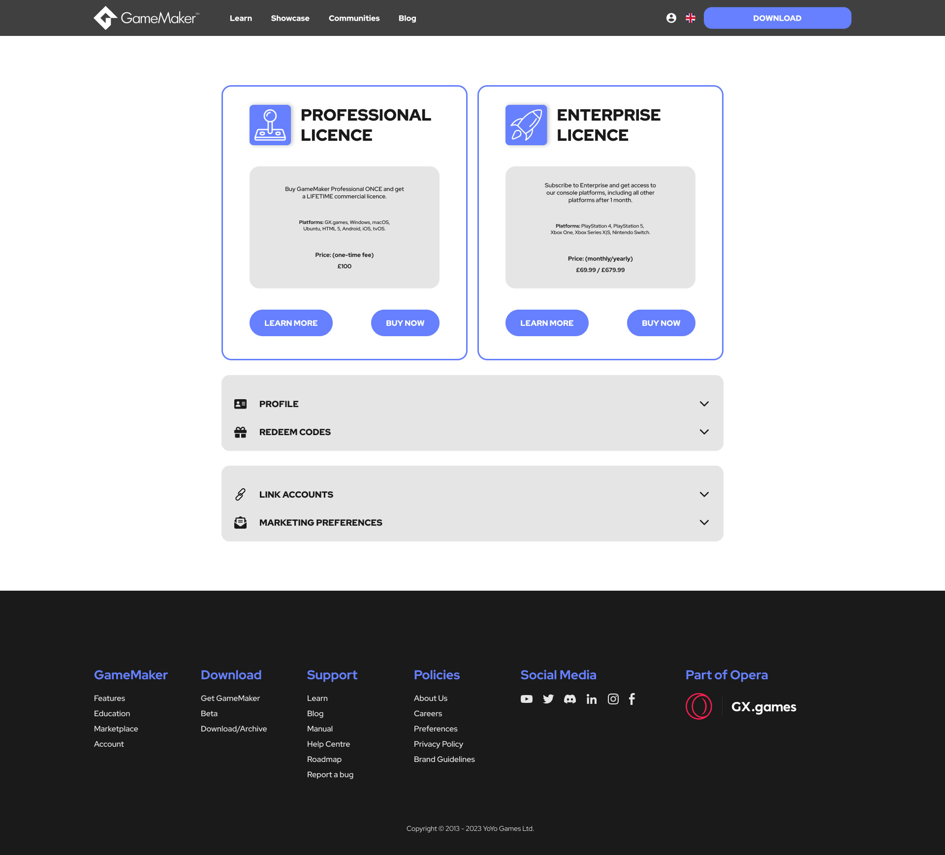
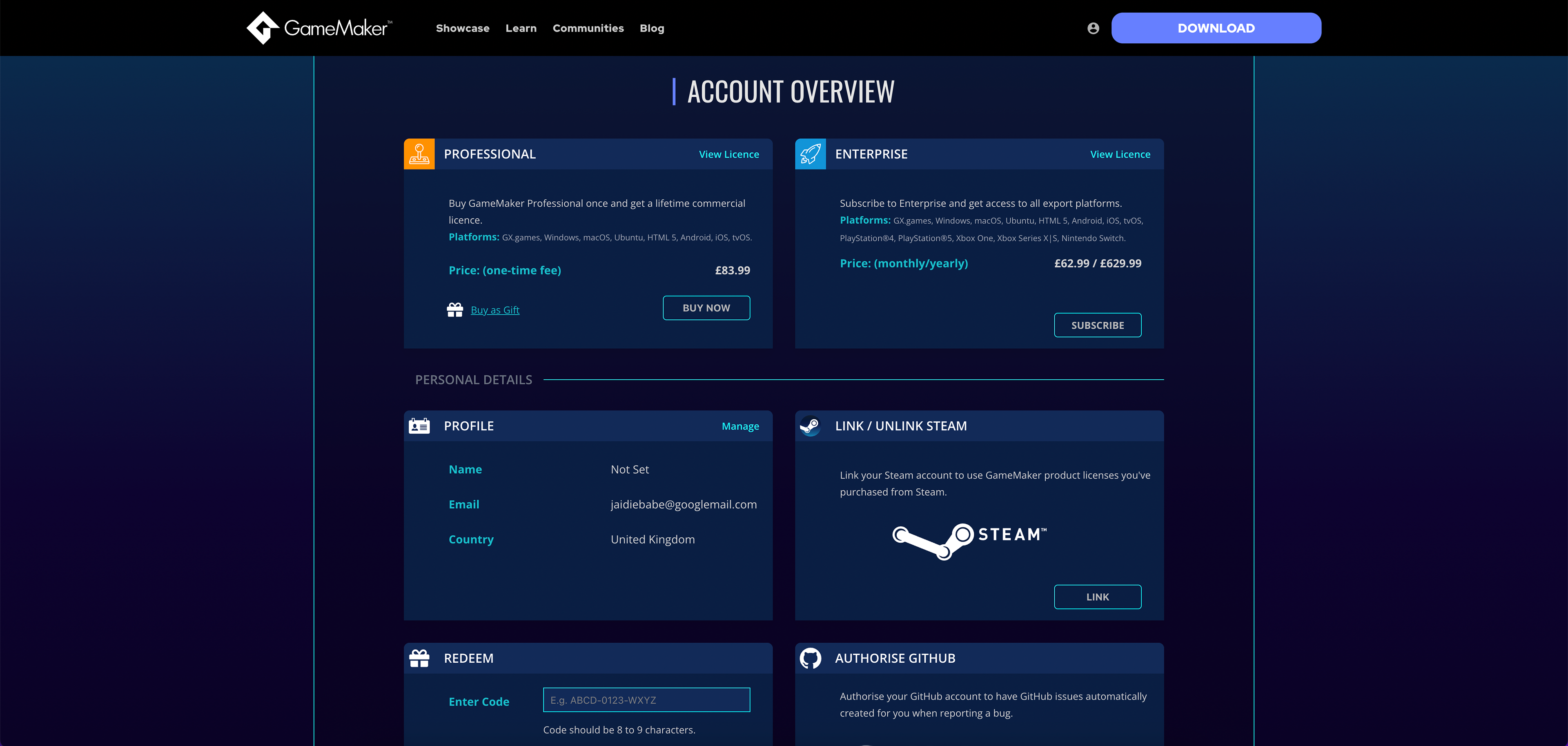
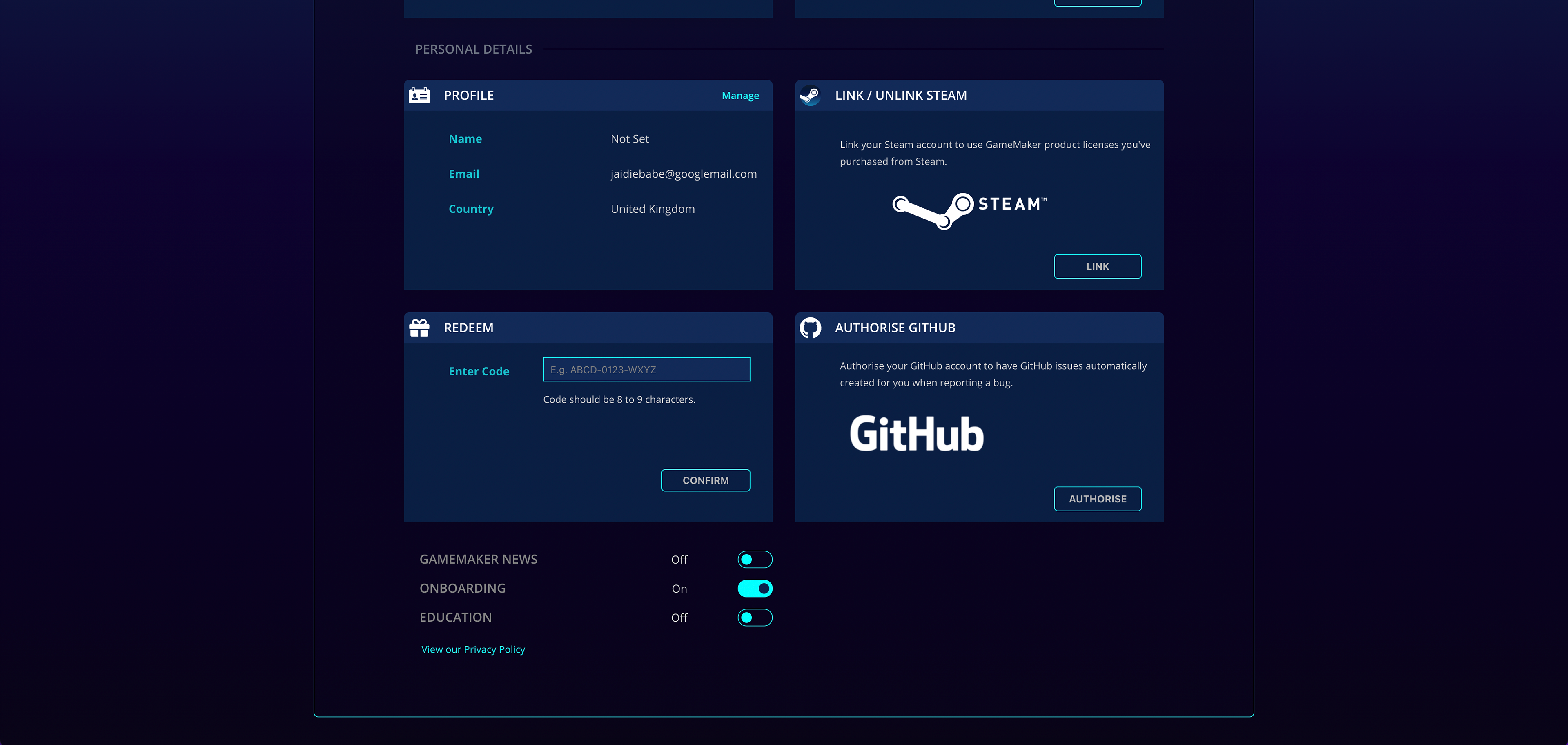
I was tasked to design what my new version of the GameMaker accounts page would look like.
I first researched UX and created flows for my design before moving into creating the final UI.
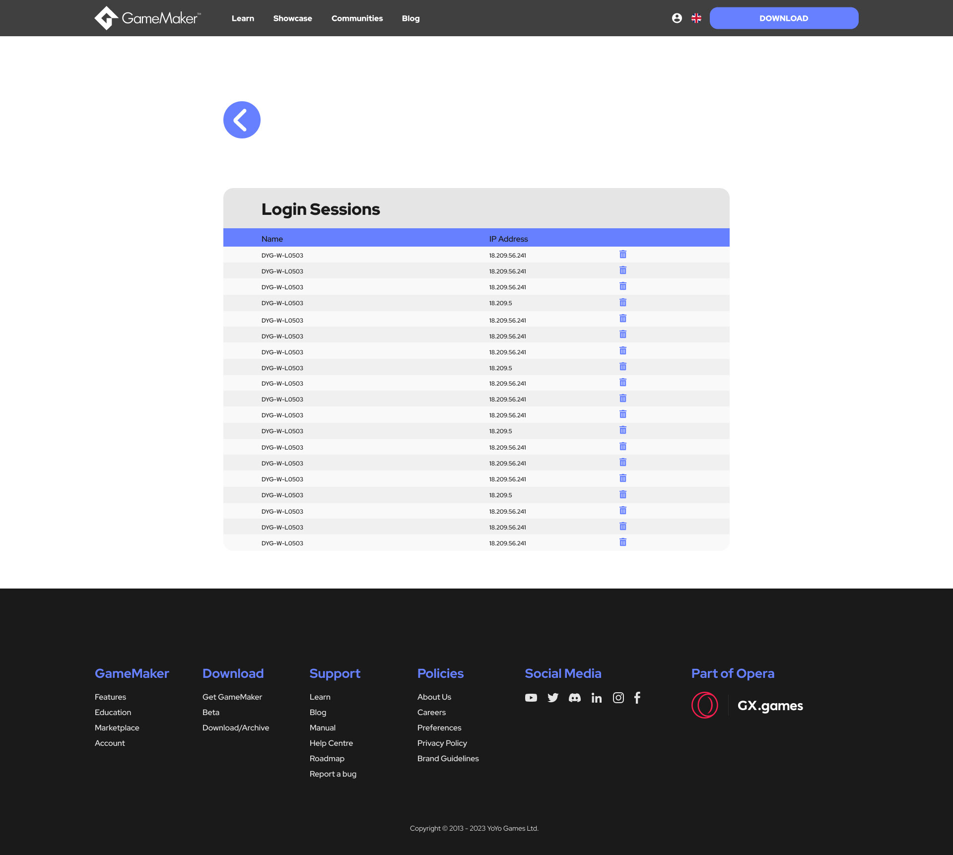
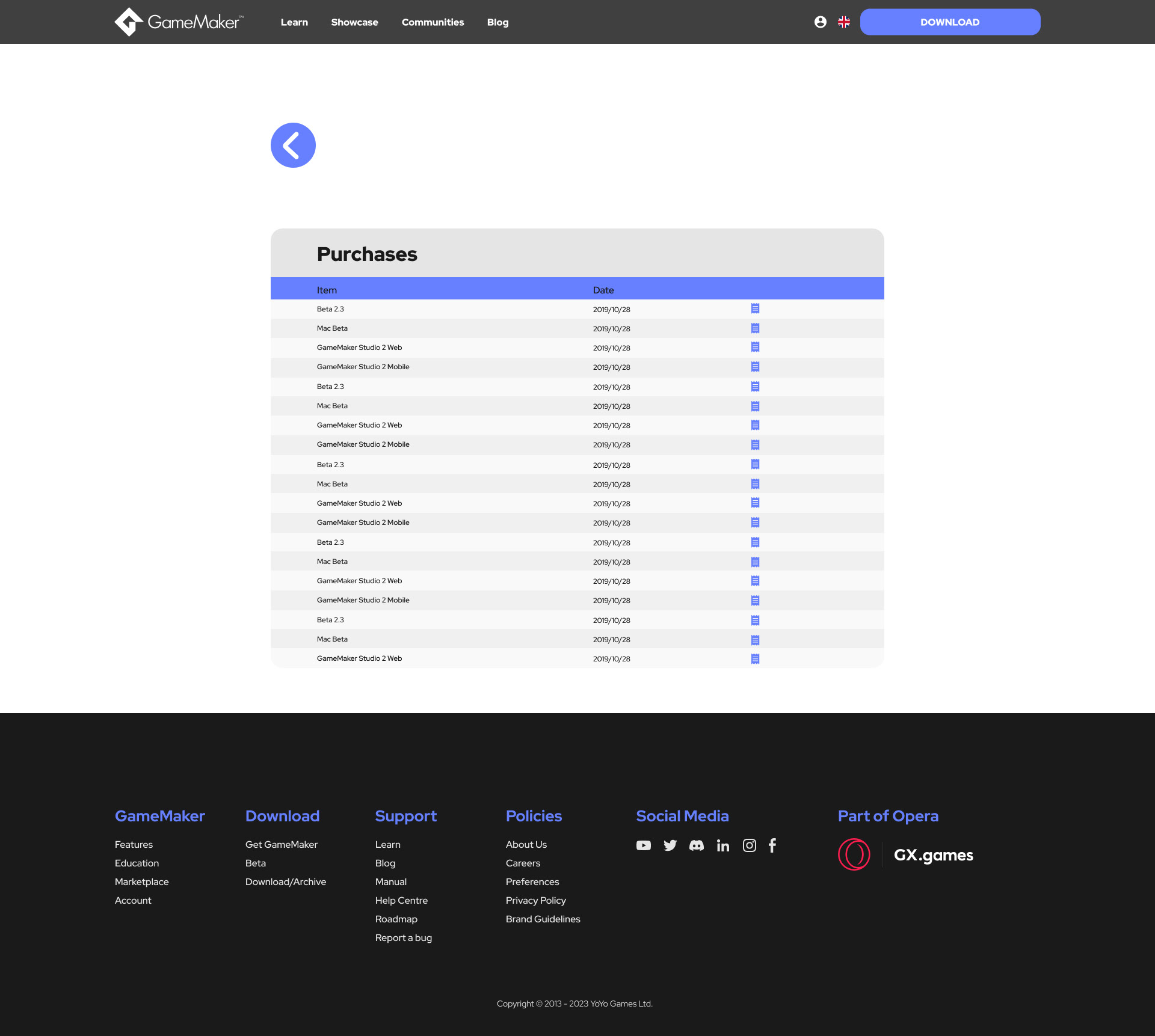
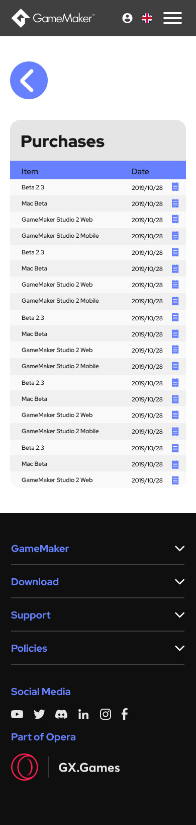
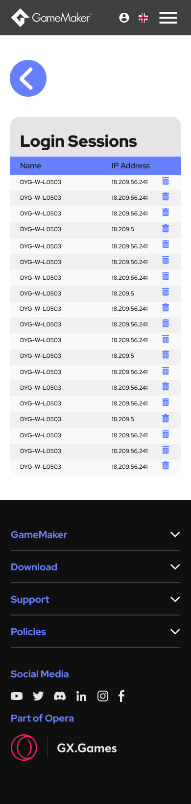
I have included 2 versions for web and one for mobile, along with the components for the drop down menus. I wanted the overall design to be more modern and sleek, leaving behind the dark distracting background that was being used previously. The focus now was purely on the actions the user would need to take to access the different sections of their account.
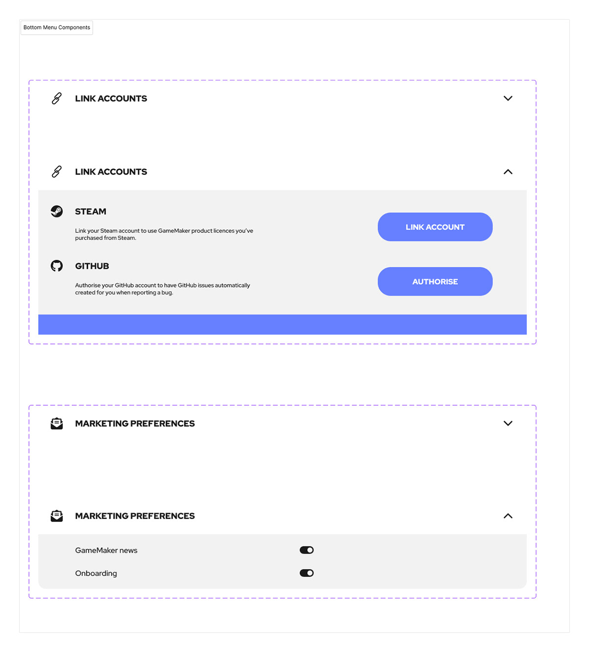
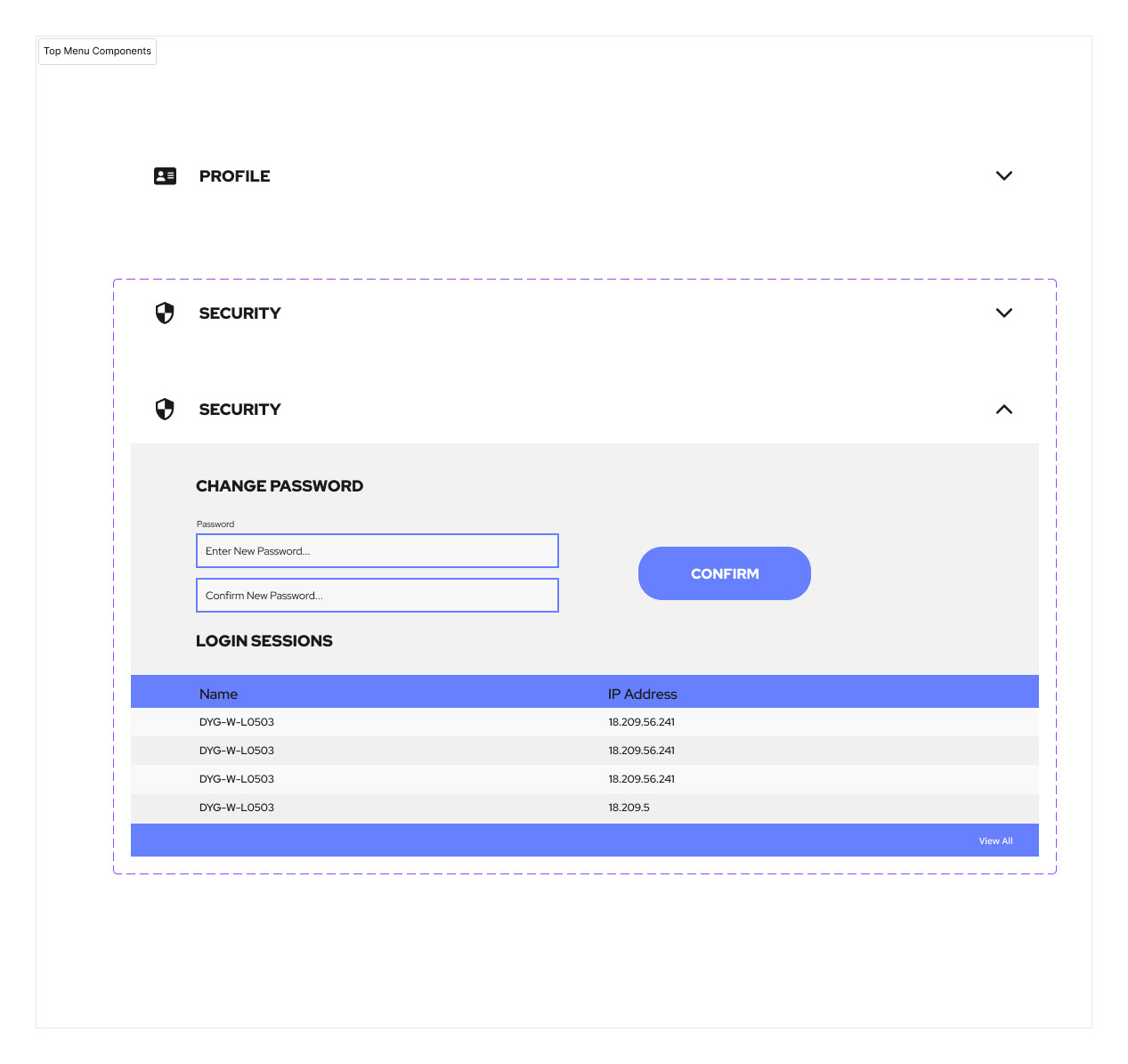
I included drop down menus in place of the 'card' designs that were used before. This was to tidy up the design and aid in readability. Now the user can open and collapse menus as they please to be able to find what they need.
This design was created in Figma.
Full Page Layouts for PC and Phone


Menu Components

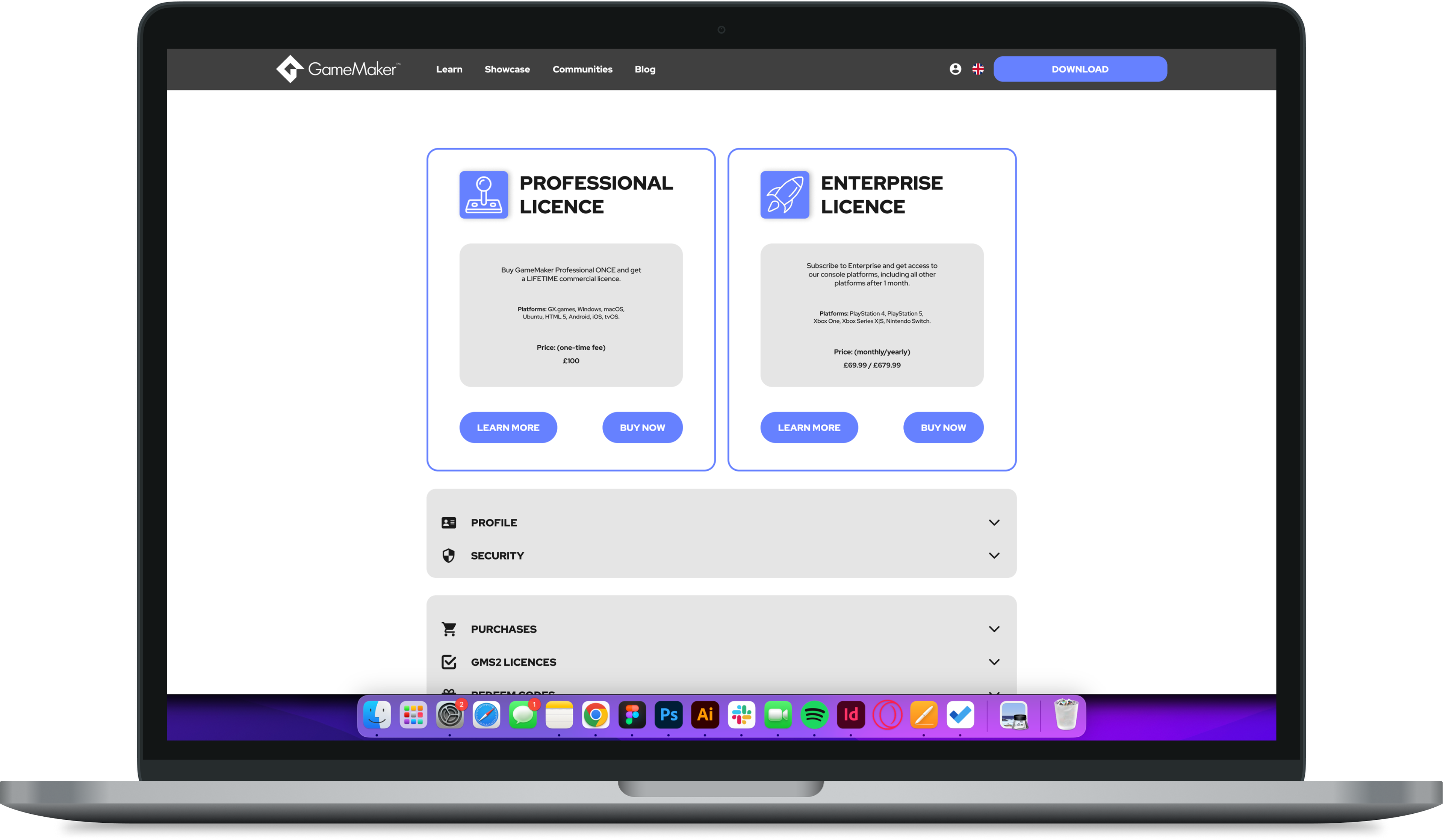
Old Accounts Page
For reference this is the current version of the accounts page that I was redesigning. As you can see it is quite dark and has not been modernised.